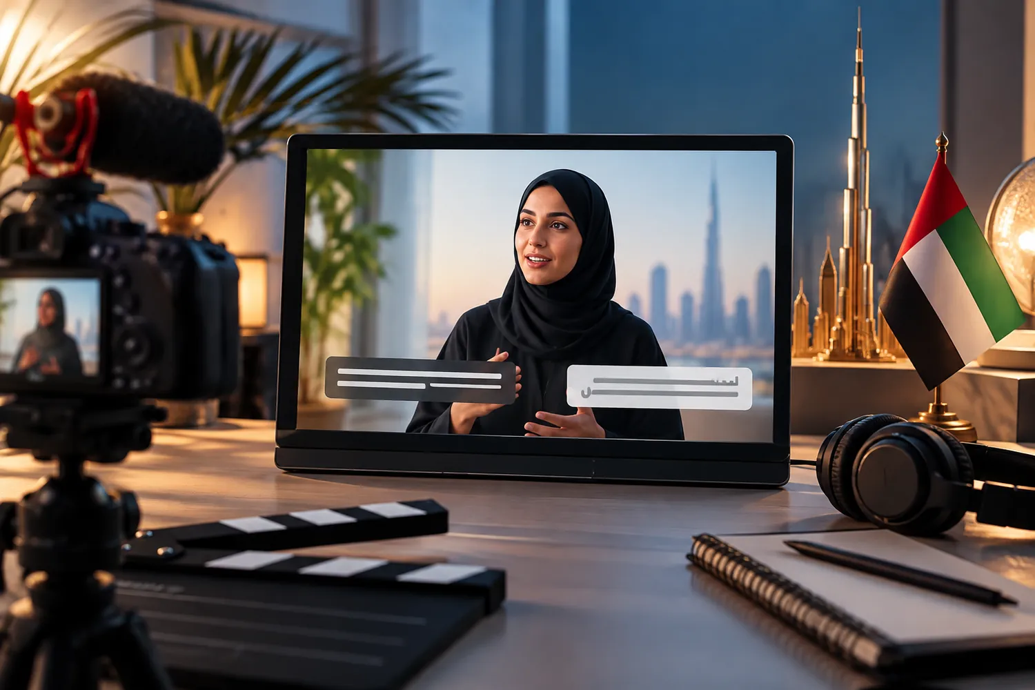
A large share of video today is watched with the sound off — on a train, in an office, scrolling a feed in a waiting room — which means a video that only communicates through its audio loses its message to a big part of its own audience before anyone hits pause to turn the volume up. Captions are not a compliance checkbox added at the end; they are how a meaningful portion of viewers will actually receive the video.
Burned-in captions against platform captions
Burned-in captions are rendered directly into the video file, which means they look exactly as designed on every platform and never fail to display — but they cannot be turned off, cannot be resized by the viewer, and have to be redone entirely for each language. Platform captions, generated or uploaded separately, adapt to the viewer's device and language settings and can be switched on or off, but their appearance is partly out of your hands and depends on the platform's own styling.
The practical answer for most brands is a mix: burned-in captions for short social clips designed to be watched muted in a feed, where control over appearance matters and the video rarely needs multiple languages, and platform captions for longer content distributed on a site or a platform with reliable native support, where flexibility matters more than exact styling control.
Designing text that survives a small, moving screen
A caption has to be readable at a glance on a phone screen, often while the viewer is also doing something else. That means short lines — long sentences broken into pieces a viewer can absorb in the time they are on screen — high contrast against the background, and a font weight that holds up at small sizes. A caption timed too fast to read, or one that sits over a busy part of the frame with low contrast, defeats the purpose even when the words are technically correct.
Arabic subtitles need their own design pass, not a mirrored template
Arabic text runs right to left, and a caption template built for a left-to-right language does not simply flip cleanly — line breaks, punctuation placement and the visual rhythm of the text all behave differently. Arabic script also tends to need slightly more vertical space at a given point size to stay legible, and mixing Arabic and Latin script or numerals within one caption needs deliberate handling so the direction does not read as broken. Treating Arabic subtitles as a genuine design pass, not a straight substitution into an English template, is the difference between captions that read naturally and ones that visibly fight the language.
The muted-first mindset
Once captions are treated as the primary way a video communicates rather than a backup, it changes how a video is cut in the first place: a key line delivered as a caption on screen at the right moment, a visual that carries the point even without narration, a pace that gives text enough time to be read rather than just heard. A video edited only for sound, with captions bolted on afterward, tends to move faster than a muted viewer can actually follow.
Our production team designs captions as part of the edit rather than a file exported at the end, in both directions of script, because a message that only survives with the sound on is a message a large part of the audience never actually gets.