A striking photo of a dish that doesn't quite look like the dish will bring a customer in once. It rarely brings them back, and the gap between the photo and the plate is one of the most common, quietly corrosive sources of disappointment in hospitality — not because the food was bad, but because the picture promised something the kitchen was never actually going to deliver.
The difference between styled and staged
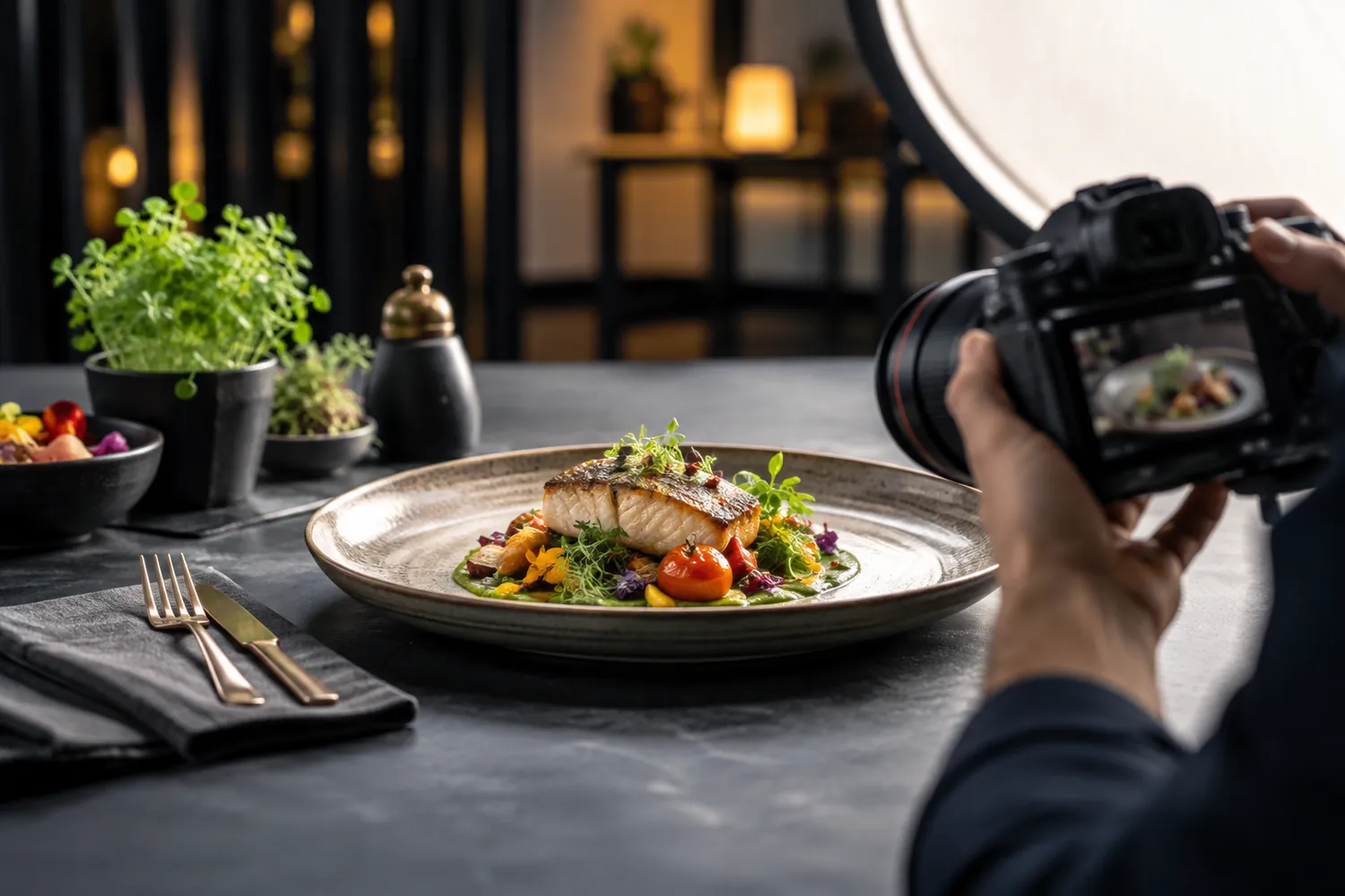
Styling a dish for a photograph — a careful plating arrangement, a garnish placed with more precision than a rushed dinner service would allow, a sauce drizzled just so — is a normal and reasonable part of food photography, because the kitchen genuinely can produce that version, just perhaps not in ninety seconds during a Friday night rush. Staging crosses a different line: props that make a portion look bigger than it is, ingredients added for the photo that aren't actually in the recipe, or a plate deliberately composed in a way the kitchen cannot realistically reproduce at volume. The test is simple — could a competent kitchen actually plate this dish to look like the photo, under normal service conditions, most of the time?
Portion size: the fastest way to lose a repeat customer
Angle and lens choice can make a portion look considerably larger than it is, and it is one of the easiest ways to accidentally oversell a dish. A customer who orders based on a photo and receives something noticeably smaller feels specifically misled about value, which is a different and more damaging reaction than simply finding a dish underwhelming. Shooting from an angle and distance that represents the true portion size protects against exactly this reaction, even when a more dramatic angle would produce a more striking image.
Colour and light that match what actually comes out of the kitchen
Heavy warm lighting can make food look more appetising in a photo while quietly shifting its colour away from how it actually appears on the pass — a sauce that reads as rich and glossy under studio lighting can look markedly different under a restaurant's regular service lighting, and the customer notices the gap even if they can't articulate why the dish feels less appealing in person. Lighting that flatters the food without meaningfully distorting its real colour keeps the photo honest without making it plain.
Consistency across the whole menu
A menu with a handful of dramatically over-styled hero shots next to plainly photographed everyday dishes creates its own credibility problem — customers notice the inconsistency and start discounting the best-looking photos as unrepresentative, which undermines even the images that were shot honestly. A menu shot with a consistent, disciplined approach across every dish, rather than saving the full treatment for two or three flagship items, builds more trust across the board than a handful of spectacular outliers.
Why this is a repeat-business question, not just a photography one
A new customer decides to visit based on a photo once. A returning customer decides whether to come back based on whether the last visit matched what they expected — and a menu that consistently undersells reality builds more loyalty than one that periodically oversells it, because disappointment is remembered longer than a merely accurate expectation. Food photography that resists the temptation to oversell is not a weaker marketing choice; it is the version that survives contact with an actual dining room.
Our production team photographs food to represent what a kitchen can actually deliver at volume, because a menu that keeps its promise is worth more over time than one that only looks good once.