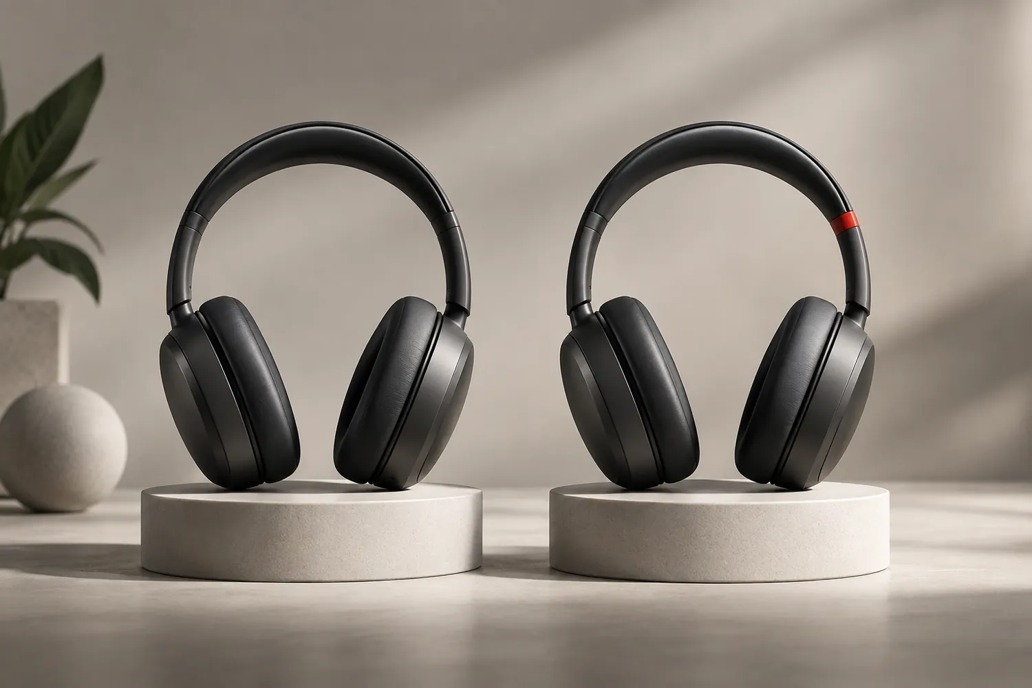
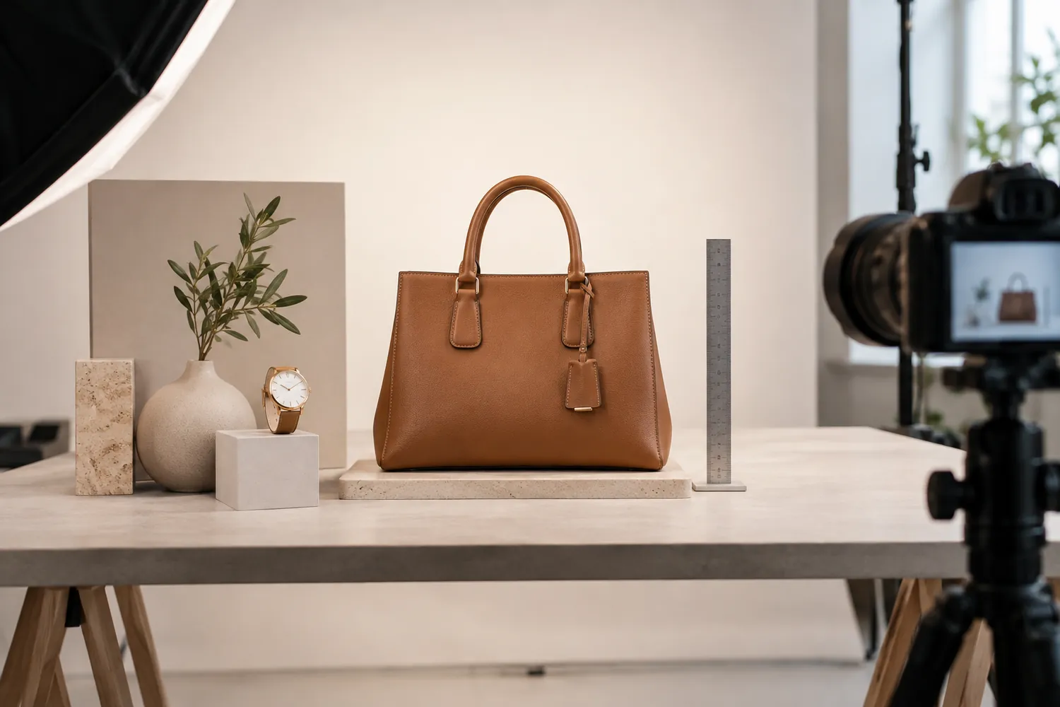
A return triggered by disappointment rather than a defect is one of the most avoidable costs in ecommerce, and it traces back further than the delivery — it usually starts with a photograph that let a customer imagine something the product could not actually deliver. Product photography's job is not only to look appealing; it is to set an expectation the physical item can meet.
Scale: letting the customer judge size correctly
A product shot in isolation against a plain background gives no reliable sense of actual size, and customers routinely fill that gap with an assumption that turns out wrong. A small accessory photographed to fill the frame can read as larger than it is; a genuinely large piece of furniture photographed the same way can look smaller once it arrives in a real room. Including a scale reference — a hand, a common object, a person in a wider shot — costs little and prevents exactly the kind of size-related disappointment that generates a return with a note saying the item "looked bigger in the photos."
Texture: showing what the material actually feels like
Overly smoothed or heavily lit product shots can make a rough fabric look sleek, a matte finish look glossy, or a textured surface look flat. None of this is usually intentional deception — it is a side effect of lighting and retouching choices made to produce a clean, attractive image — but the customer who receives something visibly rougher, more matte, or more textured than the photo suggested experiences it as the product not matching the listing, whether or not that was the actual cause. Lighting and retouching that preserves genuine texture, rather than smoothing it away, sets an expectation the delivered item can actually meet.
True colour: the gap between screen and shelf
Colour is the single most common source of "this doesn't match the photo" returns, partly because screens render colour differently from each other and partly because studio lighting can shift a colour further from reality than a photographer intends. Shooting with accurate white balance, checking a product against a physical colour reference during editing, and avoiding heavy colour grading on product shots specifically — even when it would make the image more striking — closes most of this gap. A slightly less dramatic photograph that matches the real product is worth more than a striking one that doesn't.
Multiple angles do a different job than the hero shot
A single beautifully lit hero image sells the idea of a product; it rarely shows the customer everything they need to judge whether it will suit their actual use. Additional angles — a close-up of texture, a shot showing genuine scale, a detail shot of a feature the hero image doesn't capture — reduce the number of questions a customer is left guessing about at checkout, and a customer who wasn't guessing is less likely to be surprised by what arrives.
Where the saving actually shows up
The cost of shooting a product accurately — true colour, honest texture, a clear scale reference, more than one angle — is small compared with the cost of a return: shipping both ways, restocking, and a customer who now associates the brand with disappointment rather than with the product itself. Treating accurate photography as a returns-prevention cost rather than a purely aesthetic one changes how a business should be willing to budget for it.
Our production team photographs products for accuracy as well as appeal, so the item a customer receives is recognisably the one they saw in the listing.