Most brand guideline documents are opened once, at delivery, admired for their production quality, and never opened again by the people who actually need to use them day to day. This is not because the people are careless — it is because a hundred-page document written to showcase a design studio's thoroughness is not the same document as one written to be consulted quickly by a social media coordinator on a Tuesday afternoon deadline.
Who a guideline is actually for
A brand guideline has two very different possible audiences, and most documents are written for the wrong one. One audience is other designers and agencies, who genuinely benefit from exhaustive technical detail — exact colour breakdowns across every system, full type specimens, logo construction geometry. The other, far larger audience is the business's own staff: the person writing a social caption, the person laying out a proposal, the person approving a supplier's signage mockup, none of whom will read forty pages before finishing a task due in ten minutes. A guideline written only for the first audience fails the second one completely, and the second one is who actually determines whether a brand looks consistent day to day.
Why the long version gets ignored
Length itself is not the only problem — a guideline can be long and still get used if it is well organised, and short but still ignored if it is not. The real failure is usually that the document tries to answer every possible question a designer might ever have, buried in prose, instead of answering the handful of questions an ordinary staff member actually asks in the course of a normal week: what colour, what size logo, what tone, what not to do. A hundred pages answering questions nobody in daily operations is actually asking is a hundred pages nobody in daily operations needs to open.
What a working guideline actually contains
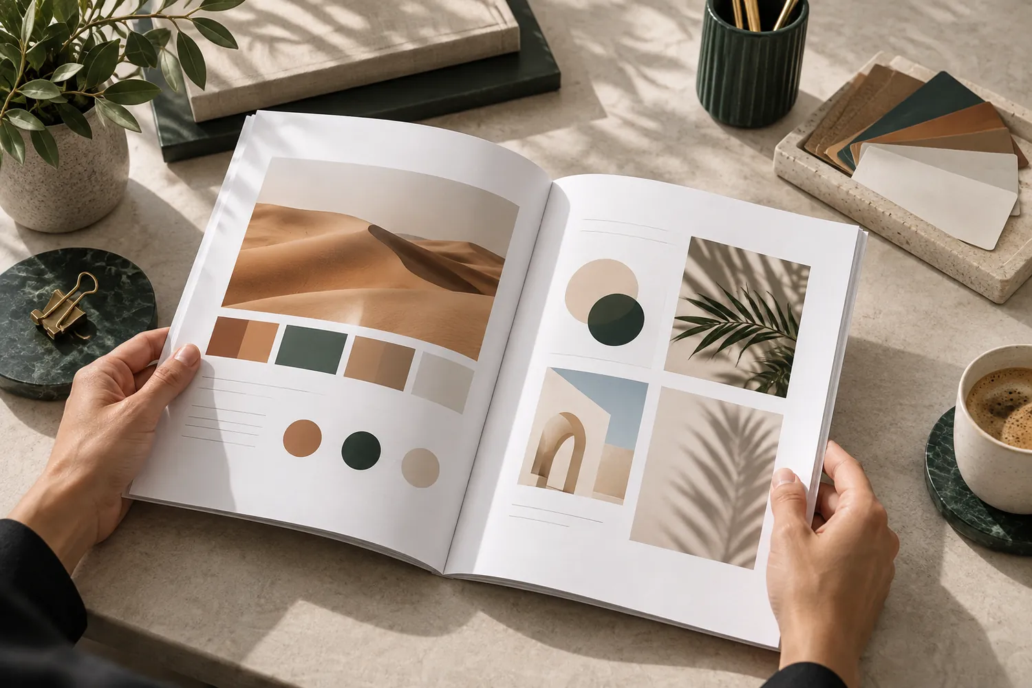
A one-page quick-reference sits at the front: the logo at its minimum size and required clearspace, the core colour palette with the codes needed for the tools staff actually use, three to five voice rules stated as plainly as possible, and a short, specific list of the mistakes that happen most often. Behind that quick page, a longer reference section can hold the exhaustive technical detail a designer or print vendor genuinely needs — but it sits behind the page people actually use daily, not instead of it. Real examples matter more than abstract rules here: a voice rule illustrated with an actual sentence the brand has written well, next to a rewritten version showing what to avoid, teaches faster than a paragraph of description ever will.
The test that actually matters
Before calling a guideline finished, hand it to someone who was not involved in writing it and give them a real task — write a caption, approve a mockup, pick a colour for a new material — and time how long it takes them to find the right answer inside the document. If it takes longer than a few minutes, the guideline is organised for the writer's convenience, not the user's, and it will sit unopened the same way the hundred-page version did.
What this buys a brand
Consistency is decided daily by people who mostly never look at a brand document again after onboarding, which means the guideline's real job is to be memorable and fast to check, not exhaustive. Our branding team builds the one-page version first and the reference appendix second, because a guideline nobody opens protects nothing, however complete it is.