A logo review can eat more meeting time than every other part of a rebrand combined, which is strange given how small a logo actually is in what a brand does for a business. The reason it eats so much time has nothing to do with its importance and everything to do with the fact that it is the one deliverable everyone in the room feels qualified to have an opinion on. Strategy documents get nodded through. A shape gets debated for weeks.
Where a logo decision genuinely matters
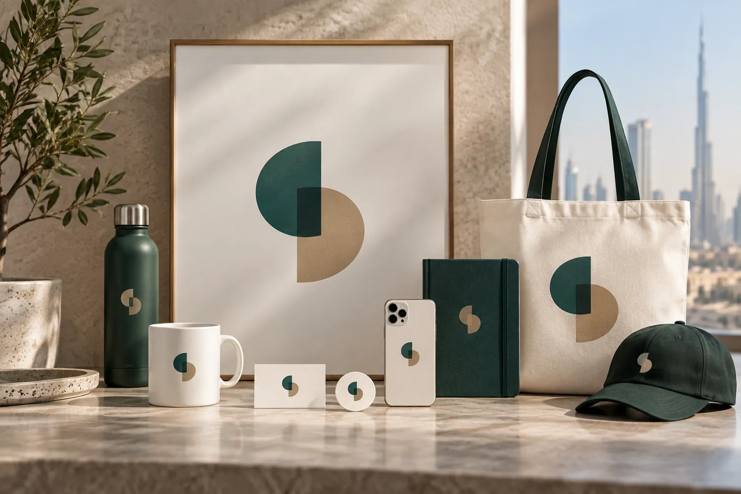
A logo has a small number of jobs, and they are all functional rather than emotional. It has to stay legible at the size it will actually be used — a favicon, a stitched cap, the corner of an invoice — not just at the size it looks best on a pitch deck. It has to survive being reproduced in a single colour, because sooner or later it will be printed, embossed or faxed in one. It has to be distinguishable at a glance from the marks already sitting in a customer's mind, including competitors' marks. And it has to hold up being small, because most of the time that is exactly how people will see it. Get these four things right and the logo is doing its actual job, regardless of whether everyone in the room personally loves it.
Where the argument is usually about nothing
Most of what a logo review actually argues about is personal taste dressed up as strategy: whether a curve should be a few degrees sharper, whether blue reads as more trustworthy than teal, whether a founder's brother-in-law thinks it looks too plain. None of this is wrong to have an opinion on, but none of it is a functional requirement either, and treating taste as if it were a business decision is what turns a two-week logo phase into a two-month one.
Ending the loop
Separate "does it work" from "do I like it" as two different conversations, not one. Test the functional requirements first — legibility, single-colour reproduction, distinctiveness, small-size clarity — and eliminate any option that fails them before taste enters the room at all.
Fix the decision criteria before anyone sees an option, not after. A shortlist that gets judged against a list agreed to in advance produces a faster, less political conversation than one where criteria get invented in real time to justify whichever option someone already prefers.
Keep the deciding group small and named in advance. A logo decided by consensus among a dozen people with a stake in the outcome is not a decision, it is a negotiation, and negotiations produce compromises that satisfy nobody rather than choices that work.
Time-box each round. A logo phase with no deadline expands to fill whatever time is available, because there is always one more variation worth seeing.
What this actually buys a business
A logo that passes the functional tests and gets decided quickly is not a lesser outcome than one argued over for months — it is usually a better one, because the energy that would have gone into the fifth round of revisions goes instead into the parts of a brand that a logo cannot do on its own: the naming, the voice, the guidelines that make the whole system usable. Our branding team runs the logo phase to end on schedule, on purpose, so the rest of the identity gets the attention a logo alone was never going to earn it.